Letterpress for iOS: Beautifully Simple
Letterpress (iTunes link) is what you might call “the new hotness” on iOS these days. It’s in a similar category as SpellTower (iTunes link), a challenging mobile word game that’s as beautiful to look at as it is hard to put down. Letterpress’ author is the creator of Tweetie, Loren Brichter (currently of Atebits), and famously is credited with inventing pull-to-refresh.
Gameplay-wise, Letterpress is a word game that plays kinda like Boggle-meets-Reversi, with a few twists thrown in. But you probably already know all of this, as Letterpress has seen its fair share of press from major news sources (Macworld, The Verge, Touch Arcade, even The Telegraph among others). So in the spirit of the simplicity of the game, this won’t be an in-depth review, just a few thoughts on the four aspects that I noticed in Letterpress’ beautiful design that are simple, thoughtful, and maybe even sexy.
Game Previews

Displayed here is the main Letterpress screen. No logo, nothing distracting, just a plain white background with some big square boxes on it (customizable with a 99 cent upgrade, but still very clean). It’s abundantly clear what your options are from here, and all of the settings you’ll never ever used are neatly tucked away under “more”.
Lots of cool stuff here - this my favorite though on the main menu. All the randomly colored squares? That is a preview of the board of each game, so at a glance you get an idea of how you’re doing, and how far along the game is. How cool is that? It’s a simple picture that conveys a ton of information, and it’s downright pretty to look at anyway. The author could have put any other number of generic images there to represent a game in progress, and they all would comparatively sucked.
Slide to Remove

As you might be able to tell from the screenshot, games in progress as well as past games are all stacked up on the main screen. You can remove games by using a relatively-standard action on iOS - a swipe to the right that reveals a delete button. This, however, is not a standard swipe, because it is DEAD SEXY. What happens is this - as you’re swiping, you’re basically grabbing the preview image of your game and dragging it overtop of the words to the right. This fades out the words and reveals the “Remove” button in a gorgeous animation that’s worth the time to download all by itself.
Oh man. It is so good.
Hidden Features

Letterpress does have a short “how to play” page, and there are a couple helpful dialog boxes to guide new players through the rules and the basics of the interface. They are really bare-bones though, which makes sense given the simplicity of the interface. Hidden away, meanwhile, are some advanced features that are naturally discovered as players get familiar with the game. One of them is the ability to drag letters around to make words instead of just tapping on them one at a time (dragging the letters is also pretty fun because it has some nice animation).
You can swipe right on the main screen to show the options menu - this makes sense, as it’s the only submenu available from the home page. Tapping on your face or your opponent’s will show the last word played. None of these features are explicitly spelled out, and they aren’t critical to the experience. If you told me about them, in fact, they probably wouldn’t be noteworthy at all - I for sure wouldn’t remember them. But discovering them accidentally, that’s a surprise and delight situation no doubt.
Focused Controls

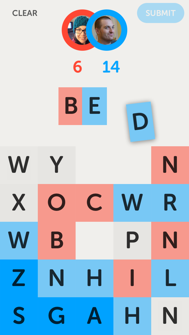
One last tiny thing. Upon first opening a game, the top left corner of the screen has a simple back button, and the top right has a button to pull up a menu. Once the user taps on a letter to start making a word, these are replaced with “cancel” and “submit” buttons respectively.
Is there enough room for all of these buttons to be on the screen at once? Sure there is. But this focuses the options that the user has, and once they start playing a word, it’s a great idea to make them either commit to that word or cancel it before doing anything else. It’s just like how the navigation disappears when you’re checking out on Amazon or most eCommerce websites these days - we want the user to be as focused as possible to make it to the end of the transaction.
And, there are more sexy animations, which helps too.
Conclusion
Letterpress for iOS is a great and beautiful game. Its clean, thoughtfully designed, and extremely streamlined interface might be a new benchmark for iOS games. While not all mobile experiences can be (or should be) as simple as this one, it’s refreshing to play a game that’s as focused as this one. If your game only has three screens, you should make them amazing, and Letterpress is right on the money.