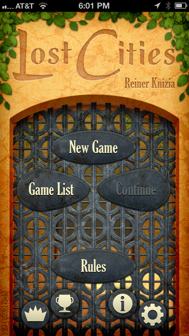
Lost Cities: The Right Way to Build a Mobile Game Tutorial

Tutorials for mobile games have a difficult problem to solve. With console games, it’s likely that gamers will be in front of a TV, can hear the game’s audio, and be generally attentive. But mobile games could be played nearly anywhere, while the device is muted, maybe for just 60 seconds at a time, and maybe only occupying 50% of the users’ attention span.
So, tutorials in mobile games must be as flexible as mobile phones are. While games like Quento are simple enough to barely need a tutorial, not all games can get away with that. Lost Cities for iOS (iTunes link) offers the most flexible tutorial I’ve ever seen in a mobile game - there are no less than four different ways for players to get the rules of this game when they fire it up for the first time.
Lost Cities is a mobile implementation of the card game originally designed by Reiner Knizia (BGG link). I’m a fan of the physical version, so I was excited to hear that TheCodingMonkeys had built an excellent recreation. It isn’t super complicated, it’s a little abstract, and it’s a great candidate for a quick game to play on your phone.
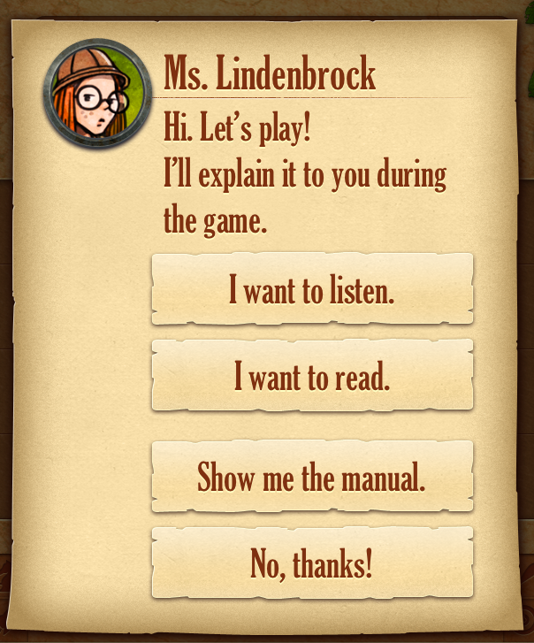
When I started playing my first game, I knew I needed a refresher on the rules, and here’s the screen that greeted me:

I was really excited by this - the game gives you the option to hear the game explained to you either in audio or in caption form via an interactive tutorial. Or, you can just read the manual yourself, OR have the manual read to you! All of these have valid use cases depending on the context in which the game is being played. When I was first presented with this screen, I was half watching some TV and I’d already played the game before, so I just read the manual.

Which is a good point - if your game is something that your users might already know how to play, don’t force them to walk through a whole tutorial on it.
I’m a big fan of board and card games, and let me tell you, there is no substitute for having someone sit down and explain the game to you. The best rulebook in the world is never going to match a real person. So it’s very helpful to have the “I want to listen” option here, where a voice explains how Lost Cities works to you in the same way a real person would. And of course, if you’re playing the game in the bathroom, “I want to read” is just as good without being super awkward.
Conclusion
When your mobile game is more complicated than Quento or Angry Birds, some explanation of the rules needs to happen. A well-designed and compact explanation of your game (I’m looking at you, 20 minute Ghost Trick intro tutorial) is the first thing many players are going to experience, so make it work for whatever environment they are in. Don’t give players a reason to procrastinate playing your game until it’s more convenient.
In the same way that responsive web design brings the right amount of design to users of all kinds of screen sizes, this is like a responsive game tutorial. No matter what level of interaction you’re looking for, there is an option that will fit your needs. Responsive Game Tutorials, you heard it here first.
This is the first time I’ve seen such a clear option given to the player in how they want to get the tutorial, and the first time I’ve seen an option to read the manual out loud. Are there other mobile adaptations of physical games out there that have creative ways to get the rules across? Let me know in the comments…