Mass Effect 3: Blindly Upgrading Weapons
The weapon system has gone through a number of changes in the Mass Effect series. In the first game, there were just so many weapons that you picked up along the way, managing them all was ridiculous. Not to mention trying to make a well informed decision about what you should be using. The disaster of that game’s inventory is well documented elsewhere (my favorite is at gamedesignreviews.com), but suffice to say it wasn’t good.
In Mass Effect 2, they solved the problems from the first game by essentially getting rid of the whole thing. I’m not sure I ever changed my weapons in the entirety of Mass Effect 2 - that’s how much they got rid of the system. Fair enough.
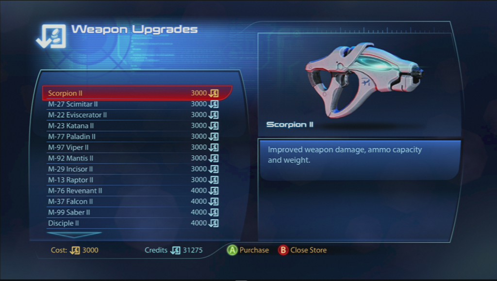
So in Mass Effect 3, BioWare got back into the swing of things a little bit with a small amount of weapon customization and upgrading. For most of the game, I ran around and was happy to find weapon upgrades strewn around during missions. Towards the end, I realized there was a shop that you could go to for upgrading your weapons. Each weapon in Mass Effect 3 has five different levels, so in the screenshot below I’m looking at upgrading my Scorpion I to the Scorpion II:
The weapon upgrade screen in Mass Effect 3
I’m not sure if this screen could possibly be less useful. Elsewhere in the game, players find the ratings for each weapon that indicate how much damage it does, its ammo capacity, and some other useful statistics that help in making a good decision on what to equip. On the upgrade screen though, all that’s listed is a very generic “improved weapon damage, ammo capacity, and weight”. Well sure, that’s awesome, but the player needs some more quantitative information than that.
Unfortunately, the game doesn’t ever provide any better information than what’s seen here. In the inventory management screen, the player can easily compare weapons by way of little bar graphs showing the weapons’ respective statistics. That same exact interface would be absolutely perfect for this screen! The player wants to know if the upgrade is worth their hard earned credits, and the game needs to provide that pertinent information when it’s needed. It seems really bizarre to me that Mass Effect 3 doesn’t reuse an already existing asset to help make this decision easier.
In addition to weighing if an upgrade is worthwhile for the money, something else to think about here is deciding which weapons to upgrade. With generally unimaginative names like “Scorpion” and “Mantis”, I know I couldn’t ever remember what guns my character was actually using, not to mention all of the other people in my party. It would be way more helpful if the weapon upgrade interface would provide the player an indication of which weapons they have recently equipped so it’s easier to make a good decision when choosing upgrades.
Also, there are five different classes of weapons - pistols, submachine guns, shotguns, assault rifles, and sniper rifles. Nowhere on the weapon upgrade screen does it list which class a weapon belongs to. It’s reasonably possible to figure it out based on what the weapon looks like, though there’s no shortage of real estate that could be better utilized for this helpful information. Or, using the weapon class names as headings might be nice to break up this massive list into smaller looking sections.
All that said, I enjoyed the weapon management system of Mass Effect 3 the best out of the whole series. But that’s not much of a compliment considering how miserable it was in the first two titles. I think it’s a little silly how weapon upgrading still feels as broken as it is. Then again, it took me most of the game to find this screen at all, so maybe in development it was subjected to the business end of the 80/20 rule. What is your take? Sound off in the comments below!
