Mass Effect 3: Keeping Track of Fetch Quests
Ah, fetch quests. The bane of RPG enthusiasts everywhere. Basically, a fetch quest is a device in a game where a character tells you “hey, go get me this thing”. So you go get the thing and bring it back to them, probably with some amount of drama along the way. It’s usually annoying, and usually unfulfilling for the gamer. The good news is that most of the time, fetch quests are only optional diversions as side quests to the main story.
While sometimes you can do your best to dress up a fetch quest so the player thinks they are doing something worthwhile, Mass Effect 3 doesn’t even try. But really, that’s not even why we’re talking about them here on that game’s ux. The problem is that Mass Effect 3 gives the player a huge number of fetch quests at once, then doesn’t offer much of a way to keep track of the quest’s progress.
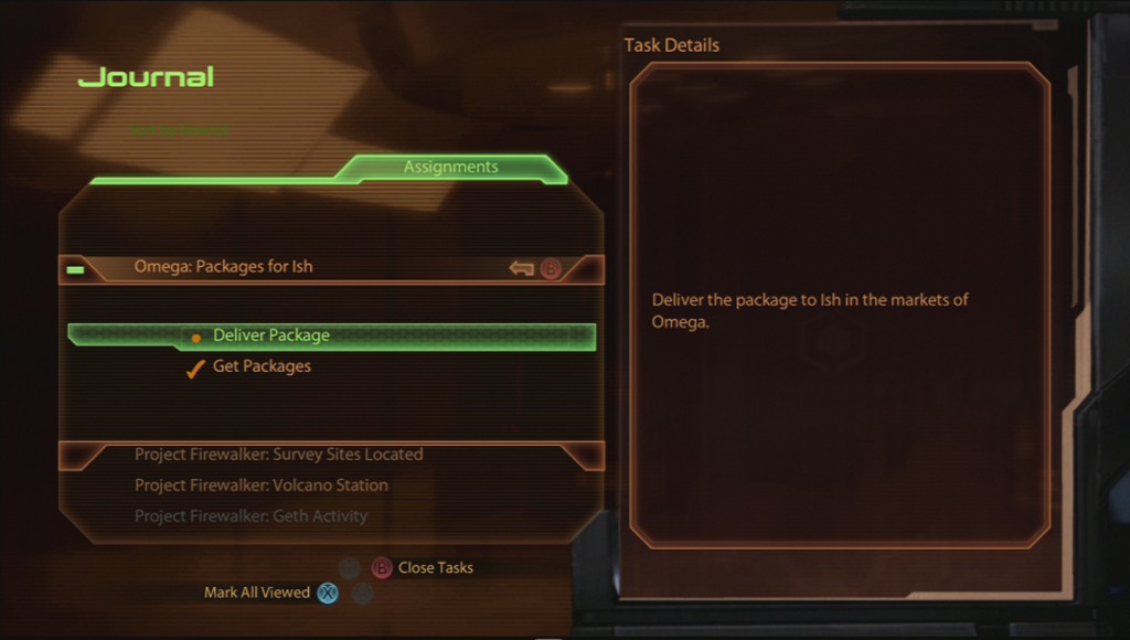
First, let me explain how much better this situation was in Mass Effect 2. The screenshot above shows the Mass Effect 2’s “Journal” screen, which is where the game gives the player details on their mission. After you get the mission, sub-bullets appear that indicate specifically how far along the player is, and what needs to be done next. That’s perfect because I have (nearly) a million missions to do, and I can’t remember exactly how far I am along on each of them! So once the player picks up an item, the game indicate who needs it, and where it should be delivered. And even better, Mass Effect 2 even lists where the player needs to go on the galaxy map, which is precisely where that information is needed.
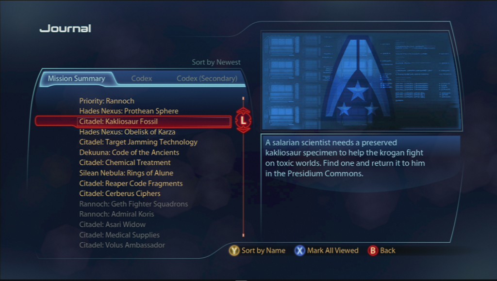
Unfortunately, Mass Effect 3’s quest system has taken a massive step backwards in the realm of usability. There are a couple of spots in the game where the player amasses these quests, and they come in large bunches. The screenshot to the right shows Mass Effect 3’s Journal screen. Notice how there’s no sub-bullets? There’s a lot less information here. So in theory, giving less information to the player could make it feel a lot less routine, such that they might have to actually do some searching to find these items. In practice though, most of the time it’s not realistically possible for to figure out where to make these quests happen if you aren’t directly told. And a lot of the time, it’s not even possible to complete the quest until some other, unknown story plot is completed.
Another one of the benefits of the detailed quest log was to show the player where they left off. When bounding around the galaxy attempting to save mankind, it’s easy to forget if you ever found that ever-crucial company flag for your comrade in the bar. In Mass Effect 2, the player always knew what the next action was by way of the quest details. But in Mass Effect 3, there isn’t anywhere to figure out if that crucial item was already picked up. It doesn’t indicate progress in the Journal, and there isn’t any kind of inventory of these items are stored in. The witholding of this information is really bizarre, and if the player has a lot of missions (which they do), it’s really easy to forget exactly where they stand. Lesson for today: always show the user their progress. It’s like using your turn signal on the highway - everybody appreciates knowing where they stand.
One more thing about the Journal screen in Mass Effect 3. In addition to lacking key information, it never takes the player to where they want to be on first load. As mentioned above, there are a lot of missions in Mass Effect 3. When a player is going to the Journal screen, they are almost certainly going to check up on what missions they haven’t completed yet - probably to see where they need to go next. But when entering the Journal, the game drops the player off right in the middle of the list of missions, both complete and incomplete. That means a lot of scrolling to get to the top of the list. Check it out on this video:
If you look closely, there’s also a glitch in the position of the scroll bar indicator, so maybe this is just a bug in the Xbox 360 version of the game. Regardless, it’s super annoying. I can’t think of any reason why you’d want to revisit a completed mission, so I have no idea why the game wouldn’t start players at the top of the list. This is where a small detail can cause a big annoyance if you aren’t paying attention to the gamer’s experience.
For a game that has really evolved in a lot of ways since the first title, it’s surprising to see this much of a backwards step for a critical part of the game. I still want to continue playing the game, but all of these frustrations were already solved in the second game, so it’s really odd to see negative progress like this for such a massive title.

