Retro Gaming UX Fails: Choosing Plays in Great Football

The Sega Master System was the 8-bit console of my household back in the day. Without a Tecmo Bowl to be had, Great Football was my American Football game of choice (i.e. the only one). If you haven’t heard of it, that’s not surprising - it doesn’t even have an entry on Wikipedia (yet!).
Great Football was released way back in 1987. For the sake of reference, Windows 3.0 was still 3 years away, and even Mac OS’ System 6 wasn’t released until 1988. Don Norman’s now-classic The Psychology of Everyday Things (_later _The Design of Everyday Things) wasn’t published yet either. So usability…was a little different back then.
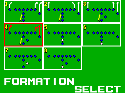
Great Football for the Sega Master System was a pretty typical 8-bit sports game, and to be honest, it hasn’t aged well. There are lots of reasons why, but one thing that particularly stands out as being extra terrible is how the players have to choose a play.
Choosing a play in Great Football goes like this: there are eight plays, and the player has to wait as the game slowly cycles through each of them. The player presses a button when the desired play is highlighted to select it. Here’s a video:

Right, so even if the player knows exactly what play to call, they still have to sit and wait for the game to cycle through each of them, which is really irritating. Each play is selected for one second, meaning the play selection process takes a fixed eight seconds, every time. I’d be curious to see the math on this, but I’m guessing the average time spent in actual game play is less than eight seconds per down.
And that’s not counting the four seconds spent before play-calling starts, with an unskippable screen showing the current score and down. That’s a total of 12 seconds the player has to wait between actual gameplay. On paper that might not sound like much, but let me tell you what it is torture if you try to finish a game of this today.
The only possible “advantage” of this is that in a two-player game, the players can try to fake out their opponent by pressing the other button, which doesn’t do anything. Indeed, there’s no game which taught me more about making the Sega Master System controller as quiet as possible.

Calling plays in Tecmo Bowl for the NES
The playcalling system in the NES’s Tecmo Bowl was vastly superior when it was released in 1989, giving direct access to plays with a D-pad and button combination. Sure, it was only four plays (eight in 1991’s Tecmo Super Bowl), but the eight plays in Great Football don’t offer as much variety as you might hope.
(Of course, that’s not to say other parts of Tecmo Bowl weren’t vastly superior to Great Football - indeed, Tecmo Bowl is a classic and Great Football isn’t for good reason.)
Conclusion
By all accounts, Great Football wasn’t a great game. I’m not sure why the developers chose to implement playcalling the way they did - technical limitations? Building suspense? Design by committee? Maybe it just wasn’t annoying in the 80’s? But I’m sure glad we have moved on from that.
What other “design patterns” from the 8-bit era are really terrible in retrospect? Or, can you think of any games today that force the player to spend more time in menus than actually playing the game? Let’s discuss in the comments!