Tiger Woods PGA Tour 12: Creating a Golfer is a Little Weird

As of this writing, Tiger Woods PGA Tour 12 is the only version of the classic golf sim to make it to iOS (iTunes link) and Android (Google Play link) platforms. For some reason golf is one of those genres of games that are way more fun than I expect them to be. Of course, this being a game produced by EA in 2013, the in-app purchase nagging is a little bit annoying, but this is still an entertaining diversion.
However, it doesn’t start out on a great foot. Creating your own custom golfer has been a staple of the series since way back in 2004, and it’s a fun part of the Tiger Woods Golf experience. It’s the first thing the game drops you into here, and it’s a little bit clunky for a variety of reasons. Let’s walk through this process.
Screen 1: New Player
Okay, so you fire up the game, and what do you get? This screen:

Obviously, the game is forcing the user to create a new player. That’s fine. But since this is an unskippable thing, why even show this screen? There’s only one thing the user can possibly do, so there’s no point. Don’t make your users go through unnecessary steps. There is zero benefit to showing this screen here.
Okay, so maybe you could argue that now the player knows there are three player slots available. That is, if they remember that, and can figure out how to get back to the player creation screen. Not worth it.
Screen 2: Enter a Name
Name your golfer. This, of course, is probably the hardest part of creating your own character. So many good names, what to pick, what to pick.
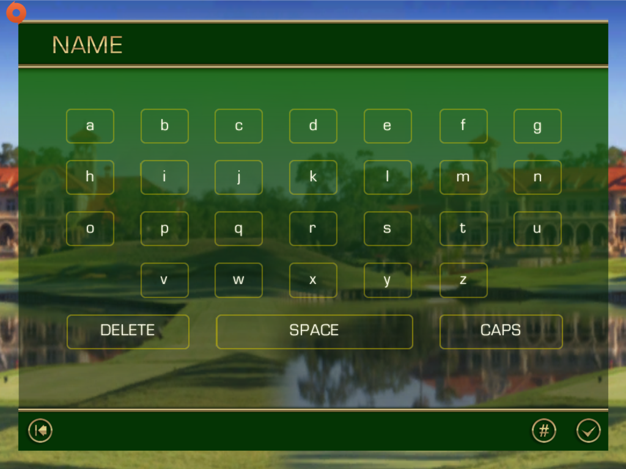
The first time I encountered this screen, it was really weird to me that the keyboard was in alphabetic order. My expectation was that it would be a QWERTY keyboard instead. A QWERTY keyboard would also have the advantage of being able to use the system’s built-in keyboard, something that I definitely would recognize.
So my first thought here is, that’s stupid, just use the built-in keyboard. But really, the answer is to know your users. For me, QWERTY is absolutely the fastest way for me to type because I know where all the keys are. But if your target user base is children or other people who aren’t familiar with touch typing, alphabetic might be a better choice for them. Or, if the application of the keyboard is more picking letters than typing, like a game of Hangman.
Jakob Nielsen’s Law of the Internet User Experience states that “users spent most of their time on other sites”. While the custom keyboard matches the style of the game, it’s definitely less familiar to users than the built-in one. Non-typist theories aside, I would have went with the built-in keyboard here (plus I could put Emoji in my golfer’s name, which is always awesome right???)
Finally, one last thing here. Ignoring all that keyboard business I just said above, who decides to put delete on the left and caps on the right? That’s the complete opposite of where they are on a normal keyboard. I know, the keyboard already isn’t normal, but it’s like the game is trying really hard to make you screw up.
Screen 3: Gender & Skin Color
On the next screen, the game makes the user pick their golfer’s gender and skin color.
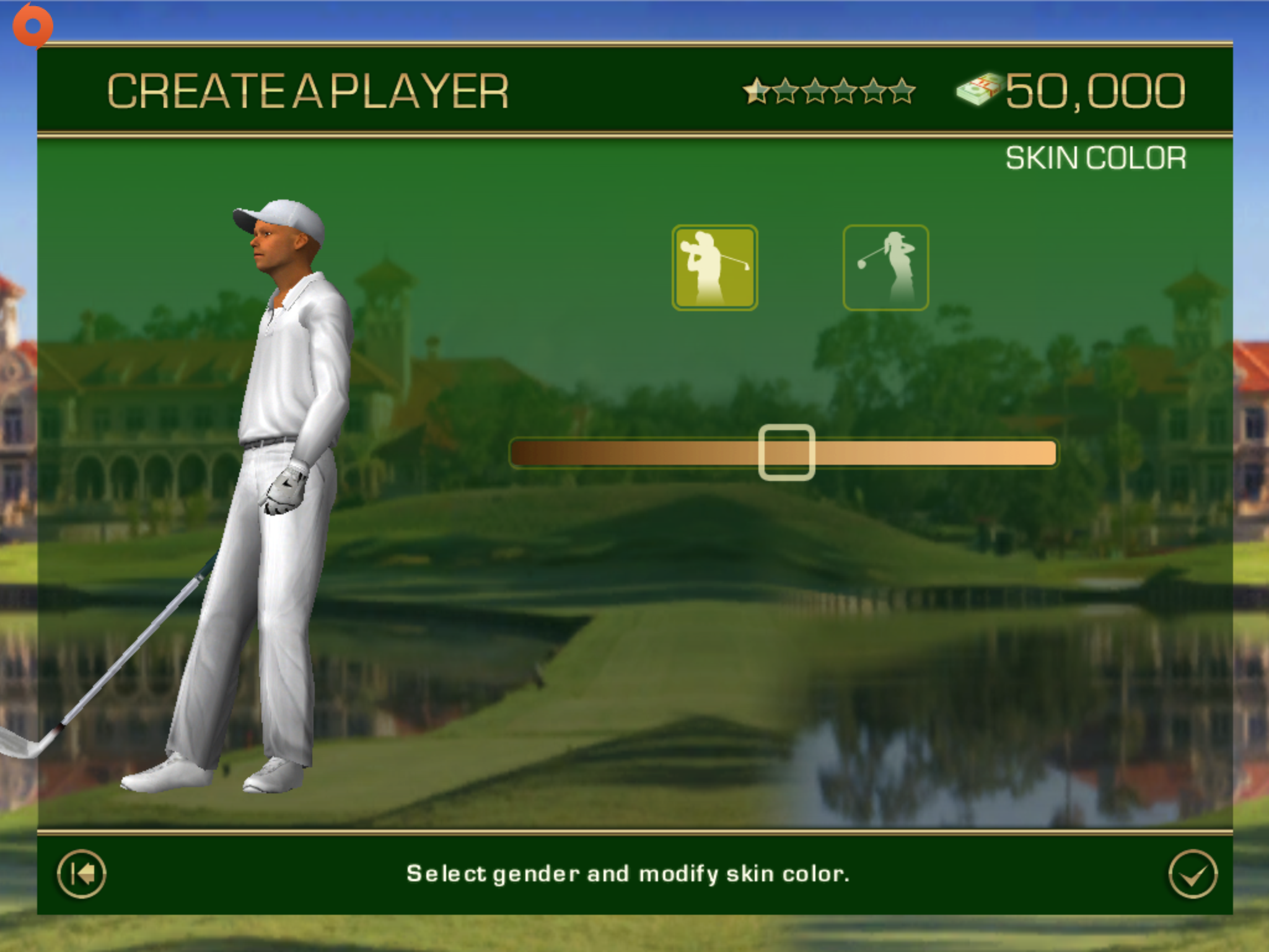
Had the previous screen used the built-in keyboard for name entry, all of this stuff could have easily been on one page, again reducing the size of this wizard. But oh well. My main beef is there’s barely any difference between the man and woman silhouettes on the buttons. The only way that I can tell which one is the lady is because of the ponytail. If you miss the ponytail, it’s going to be impossible to tell which is which.
If one button had only a ponytail on it, and the other only a baseball cap, that would have been bizarre, but way easier to tell apart. There’s any number of better ways to do this. If you’re using only graphics for buttons, make sure they are easy to identify.
Screen 4: Clothing Colors
And now we’re ready to dress our golfer, which you can do with this wonderful screen.
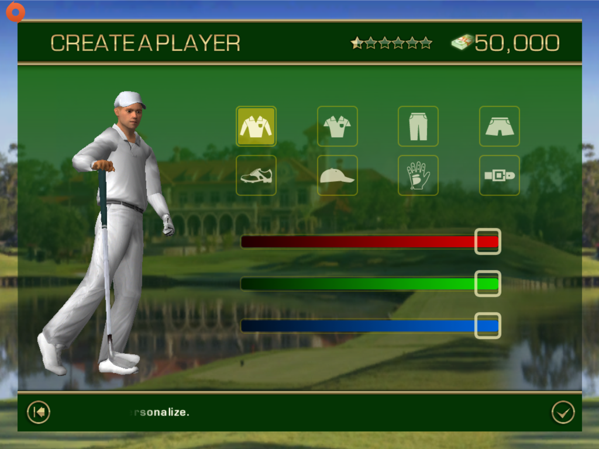
Let’s tackle the obvious problem first. RGB sliders for color <— this is something that you should not ever do (at least as the default). Mixing colors in RGB isn’t an intuitive thing for the vast majority of people out there. It shouldn’t be so difficult to make an orange shirt. Unless you are targeting graphic designers in your app, use a normal color picker. Or at least use a hue-saturation-lightness color picker. I mean, that’s still a bad decision, but I’d argue it’s at least a little more understandable for the normal user.
Okay, then the rest of the screen. There are two neat rows of four buttons each. But they aren’t all equal - the top row has the user selecting if their golfer has a short or long-sleeved shirt, as well as long pants or shorts. The last one touched will be the selection.
There are just too many controls packed in here without enough information. Maybe a little checkmark on your choice? Sure, you can see it actually on the animated golfer, but that’s not the point. Controls that look the same should act the same, and these don’t.
Screen 5: Skills
By this point I’m nearly exhausted, right? Okay, that’s an exaggeration, but it’s been a long road to get this far, and this madness is what I’m greeted with.
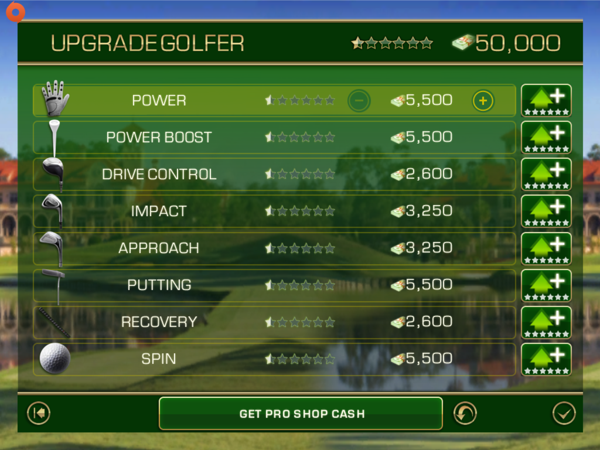
I’m a first time player, and you’re asking me to blow my in-game bank account on what? Some of the skills, you can guess at what they do - right, Power, Putting, Spin, sure. But what is Impact? And Recovery? Approach, maybe I kinda know what that means? At least offer some kind of help so I can try making a reasonable decision here. Or better yet, don’t ask me these things before I even get to the main menu for the first time.
Also, so those buttons on the right with a bunch of stars, an up arrow, and a plus sign? My first thought on those is “I’m not sure really what that does, because there’s a lot of symbols happening”. Eventually I figured it was a shortcut to sink as much money as I had into that stat. I should have known better, because this is what I got:
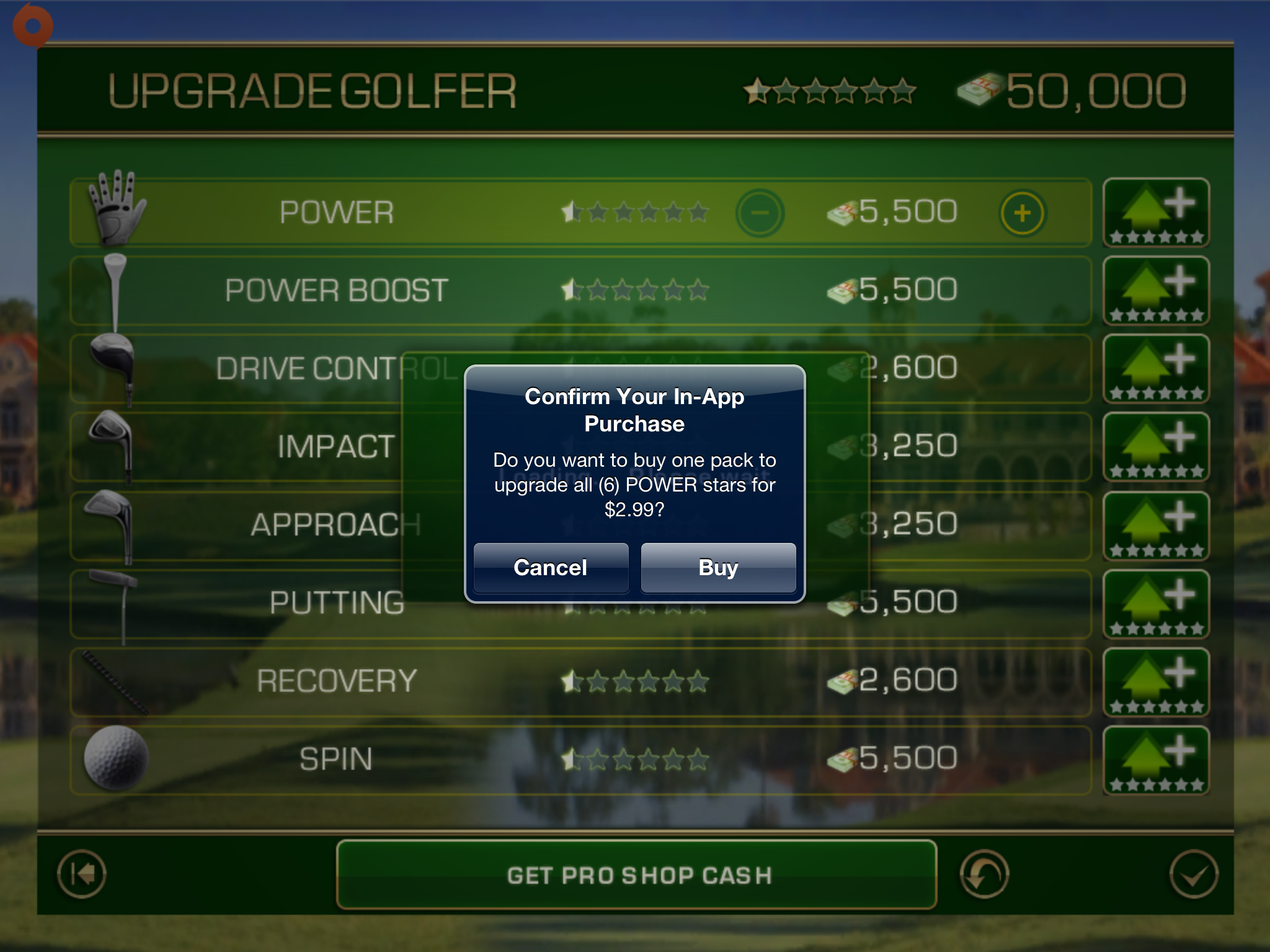
Ah, it’s an in-app purchase. Thankfully, with the iOS Smurfberry controversy behind us, there’s little chance that I would have accidentally paid EA $2.99 for 6 stars. But, this pop-up actually scared me, because I felt like I was a mis-tap away from spending money accidentally (I know, I wasn’t). I know putting a dollar sign on your button probably doesn’t increase sales, but trying to trick your users into an in-app purchase is frustrating.
Thankfully, this was the end of the character creation process. The next screen was the safety of the main menu, where I can finally play the game (and where EA will tell me about how great FIFA 13 is.)
Conclusion
The character creation process is an important one for games. Gamers want to feel connected to their player (just ask anyone who’s spent 12 hours creating a character in a WWE game).
Also important is the experience that users get when they first fire up an app. A large barrier to starting up your game means a larger percentage of users won’t ever play it; particularly if it’s free (which Tiger Woods PGA Tour 12 is not right now). Forcing your user to create a character when they first open up the game isn’t a bad thing necessarily, though the process has to be smooth.
Any other character creators in games that are especially interesting? Are you a huge fan of RGB color sliders? Let’s discuss in the comments!