Title Screens: Because You Aren't Done Waiting Just Yet

Title screens. Nearly every console and PC game has one. Back in the arcades, the title screen was the tollbooth to the highway of gaming bliss. But with a game that you’ve already purchased, what is the title screen really doing for us these days? And a better question, why do a lot of games delay loading content until after the title screen?
Title screens have changed a lot over the years - in arcade games like Pac-Man, you barely even saw the title screen because most of the time, the game was in attract mode trying to extract quarters from your pocket. Non-arcade games meanwhile always had some kind of intro video to get you psyched before the title screen ever hit. Just like those Flash website intro videos that used to be all the rage back in the 90’s, gamers have better things to do than watch the same video every time they grab their controller. Thankfully, most games these days don’t include a pointless intro video that gets skipped 99.999% of the time. But, with games getting more complicated and relying on an internet connection, there’s still that pesky issue of loading content to prepare the player for their session.
Let’s take MLB 2K12 for example. Here’s a video of the title screen up until you get to the first menu:
While the video doesn’t start right from the XBox 360 dashboard, the game’s title screen loads relatively quickly. Unfortunately though, once the title screen is dismissed, it takes over 30 seconds to load the various content and shuttle the player to the main menu!
So here’s my first point: why on earth do games stop players at the title screen, seemingly in the middle of the loading process? The only thing you can do is press start. This means if I’m sitting down to play this game, I have to wait for the game to load, press start, then wait for the game to load again. The game knows I have to load the content, just load it before the title screen so I can go make a sandwich or something. It’s like when you’re set to install Windows XP, and there are a bunch of irritating prompts right in the middle of the install process. It would be a lot easier to deal with if all of the loading was grouped together. Then once the game is ready, the player can press start and immediately start playing.
There is good news here, though. MLB 2K12 smartly prepares all of the player’s various save games so it’s ready to play right away. I’ve got three different “in progress” game types: an MLB Today season, a franchise mode team, and a custom “be-a-pro” style player. All three are listed right on the menu for me to choose. In lots of other sports games, the player has to pick between starting a new franchise or loading their existing one every time they play - that’s pretty silly considering if I have a saved franchise, I’m almost certainly going to play that one. Here’s the point: games need to help players out by pre-loading content they are almost always going to use (but do it before the title screen!)
NHL 12 handles the title screen similarly - the player has to press start, then a bunch of content is loaded. It’s a little faster - clocking in at about 21 seconds - but it also includes a couple of prompts that the user has to react to. One is picking the location of the save file - a common occurrence on the XBox 360 since the advent of “cloud storage”. I only have one save file, why can’t the game remember where it is?
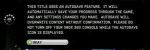
Anyway, a second prompt is less useful - it’s the autosave warning. This comes up every single time you start up the game, warning the player that the game is going to periodically save…and probably some other stuff, but who actually reads it? This definitely looks like something that the legal department felt was required, because it’s 100% useless to the gamer. Don’t force players to click through meaningless text every time they start up your game. This process does exactly two things - annoy players, and make it take longer for them to play your game. Don’t do it.
Here’s a question: do we need a title screen at all these days? Why introduce a forced “break” at the start of your game anyway? For games like MLB 2K12 and NHL 12, they are big, complex endeavors that generally have a lot of menus. At least the game could drop the player off at the main menu, right? Put a big logo in the corner and the player is already a step ahead. For less-complicated games, you could even do better. Take the now-classic indie platformer Braid for example:
This video was taken from a completed playthrough, so it’s not quite the same as a first-time experience - the image at right shows where the player is dropped off the very first time through. But the point is still valid - no title screen, no menus, nothing. The player is ready for immediate action. Of course, there aren’t really other “game modes”, so it’s hardly reasonable to expect a complicated sports sim to act the same way as a simple (but still awesome) platformer like Braid.
Title screens in games today often aren’t anything more than a chance for designers to showcase their logo work. What do you think - are there cases where a title screen offers something compelling to players that I’m overlooking? Or maybe if the game loaded everything up front, it would take too long - that the title screen offers a nice break where the users don’t notice the second loading session as much? Your opinions are always welcome, sound off in the comments below.

